On Ancestors, Role Models and Color Theory
Summary
- Type
- Letter
- Written
- Place
- Gothersgade, Copenhagen, Denmark
- Author
- Michael Baastrup Chang
On Ancestors, Role Models and Color Theory reflects on a period of intensive image-making involving copperplate prints, photogravures, paintings and drawings. The letter considers artistic ancestry, family, role models, color, photogravure and the experience of finding a sense of kinship with another artist. It also describes a personal color theory developed from an experience of sound, light and conversation in California.
Letter
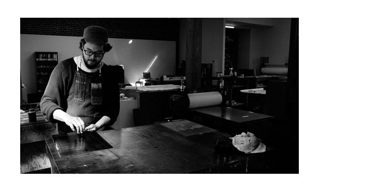
It’s been a while since my last Y-letter. Instead of reflecting on what is, I’ve been engrossed in the physical business of making images. It’s been a work in progress for some time now, consisting of copperplate prints produced at the Danish Art Workshops (Statens Værksteder for Kunst) in Copenhagen in 2012; photogravures made at Crown Point Press in San Francisco last summer, in 2013; and paintings and drawings done in my atelier at Tietgensgade in Copenhagen. Action is a natural enemy of contemplation.
This Y-letter is meant to tap their essence. Not like rays of light in the style of Harry Potter, but rather like translucent threads of letters through which a light shines. Let’s submerge in the flow of my memories and explore role models, ancestors and the sensation of finding a kindred spirit.
ABOUT THE EXHIBITION
By way of introduction, the exhibition begins with a series of photocopied portraits of my ancestors. These have been transferred to gampi paper with the help of acetone, and then printed as chine-collé with aquatint by way of copper surfboards. A series of photogravures follows. These images, produced in the summer of 2013 at Crown Point Press in San Francisco, are also printed using the chine-collé method, with gampi paper on 300 gram Somerset. Finally, the exhibition includes a series of tempera paintings, all adhering to the first three dogmas in my grammar for images: (1) Autobiography, (2) Proportions, (3) Gesticulation.
Like the proportions used in my work, the colors in my forthcoming exhibitions are closely linked to one another. They are created from and live on in one another, just as a father and a son and all of their sons and daughters that follow spring from the same well.
A COLOR THEORY
In the summer of 2013 I was in California. One evening, in Marty McCutcheon’s Berkeley studio with Marty, Brad Wise and Mary Jane, I experienced that the character of the flow of words hanging in the room morphed from a series of sounds to a wave of colored frequencies. At the same time, I experienced my chakras’ colors mixing on their own axes, not unlike a Rubik’s Cube.
The experience can also be described as surfing on a conversation that has assumed the form of a rough sea of light in various frequencies. Quite suddenly and without any warning, the sensation of surfing brought me in contact with a theory of colors. And whilst I was taking in the conversation with my eyes, I was possessed with the idea of taking notes on this color theory.
But you know how it is. The world of theory is ephemeral and the bridges built to the world of practice can be rather precarious. My hands were rebellious and the task of grasping hold of the theory and transmitting it to paper as the idea developed proved a singular challenge. Remember, I was surfing on a wild sea, clutching a thought and trying not to lose my balance. It was a breathtaking struggle, but in the end I succeeded.
In brief, my theory in all of its simplicity is that all wavelengths can be received as a kind of “color”; even wavelengths that are beyond the spectrum of what our eyes can perceive. I draw a parallel to the Korean Zen-Buddhist art with which I work, where the concept is that one should be able to see every “color” in a monochrome brushstroke. The color theory, then, is a method of observing beyond the spectrum of colors visible to the eye.
And maybe the theory isn’t so abstract after all. We know, for example, that many animals are able to perceive a number of wavelengths that are out of our reach.
Honeybees sense the ultraviolet frequencies of flowers and their pollen; it is the same ultraviolet frequency emitted by our bodily fluids — blood, urine, semen, tears and breastmilk. But we can’t see the ultraviolet frequency with the naked eye; we need an ultraviolet light.
There are other wavelengths that we can only hear, for example radio waves that are transmitted over long distances and received by antennas.
We know that whales sing at a frequency imperceptible to the human ear, but we may sense the tones of their song as a kind of silent tremble.
We also know that sharks have a sixth sense that allows them to perceive frequencies comparable to electricity. It’s possible that they use this sense to sort sick fish from healthy ones, thereby helping to hold balance in the marine ecosystem.
The popular science lightness of my new-age-color theory notwithstanding, I think that the theory can, when put into practice, have a catalytic function for me when comparing the unexpected. I am inspired by something that Marty said this summer. I paraphrase:
There are some colors I like more than others. I often let my love of colors guide me.
The goal of my theory could be to, like Marty, use love to choose colors that can elicit some of the existential questions I love to engage in when I work.
A SENSATION OF KINSHIP WITH ELI PONSAING
When I came home from America and had finished the greater part of the work for my upcoming exhibition, I began thinking about how the newest members of a family contribute to extending a family’s particular wavelength. Not only a “family” in the biological sense.
When I came home from Berkeley and the warm and loving light of the McCutcheon family in July of 2013, I had a portfolio of photogravures and the practical experience to make them that I had gained at Crown Point fresh in my mind. I felt that I had added a new facet to the objective lens through which I view the world.
Maybe that was why I was able to see the extraordinary light that photogravures exude. That was how I happened across Eli Ponsaing, a Danish visual and lithographic artist, and copperplate printer who had spent his life working with photogravures and even invented a unique technique for them.
After visiting Eli’s website I felt a deep solidarity with him, and I wanted to meet him.
Eli’s works are alive with curiosity, non-figurative and they radiate their own particular authority.
I see the quality I seek in my own works in Eli’s works. They remind me of the watchfulness that allows us to feel and be imbued with the strong energy present in objects of nature like stones, leaves, trees, water and natural phenomena like a sky resplendent with circular changes in the seasonal light. This also brings my thoughts to Jan [Kather], who stands on the suspension bridge between the parking lot and the Cornell campus and lets the rushing water and the thrill of the abyss fill her with energy for the day ahead.
I decided to send Eli an email and try to arrange a meeting. Some time later, I was contacted by one of his grandchildren. He wrote:
“Hi Michael. I’m Eli’s grandson Jonas, and I regret to inform you that Eli passed away in June of this year. I know he would have been very happy to receive your mail — he would have loved to see your work. I’m sure you would have been able to talk for hours on end! It’s great to hear that Eli’s work has inspired other artists, and apparently still does. Eli left a number of books that he had written, including some on the techniques he used. I’ve spoken to the others in the family, and we believe that Eli would have wanted us to give you a copy of some of his books. […]”
The episode was and still is deeply moving. I am astounded by the contact that can be established through one’s work with art, and how deeply binding the sense of kinship can be. I sense that Eli and I shared a particular frequency; one that arises with the energy and interest that one can invest in one’s life and work.
Those were some of the thoughts and experiences I wanted to share with you today. It’s also an invitation for you to share your own experiences with ancestors, role models and color theory with me and with each other.
“I am still into recurring cycles, rhythms, and then the textures that impact the body. I am thinking about spaces that reverberated and echoed for me in the past and how these carry forward affectively into my sonic work. I feel these very deeply and I think your metaphor of wavelengths is totally on the money here. My antenna picks up waves from underground electronic dance parties as well as classical music (13-20 years ago) like an after-image. There are such a range of sonic frequencies, envelopes, velocities: largo; presto; euphoria; melancholia.
Some of this has to do with the klangfarbenmelodie I mentioned in another mail. I am led to different tone/sound colours (timbres) that pull or push the body and how it feels in multiple ways — how it felt then, how it feels now. How I am overtaken by events of mindbody mostly unexpected. In recent years this has been a tension between surging forward and disconnecting or dropping out/interruptions. These timbres also tell me about the spaces the body once inhabited with freedom that it perhaps now struggles or feels unsupported in.
Am I like a shark sorting out sick fish (frequencies/textures/timbres) from healthy ones using a making method to enable a better homeostasis in sound for me and others? I do not aim for total unity but there is some kind of back and forth, an ecosystem of klangfarbens.”
— Melanie Chilianis, quote from a reply to “On Ancestors, Role Models and Color Theory,” December 30, 2013
Archive Context
On Ancestors, Role Models and Color Theory was originally written as an email letter to friends and colleagues. It forms part of a group of letters written around 2011–2013 and subsequently collected under the title On Art.
The individual letters are preserved here as separate archival records in order to retain their individual subjects, dates, references and relationships to the wider artistic practice.