Colours Collected From A Childhood
Catalogue Text
Trine Ross. Master of Art History, art critic and writer at Politiken, lecturer, author, and (art) debater. Published: 2020.
Even though few have read In Search of Lost Time, most people know that it is a madeleine cake that sends Proust on a journey through memory. And we all know the sensation: how a scent, a shaft of light, or a particular colour can suddenly unfold memories we barely remembered having.
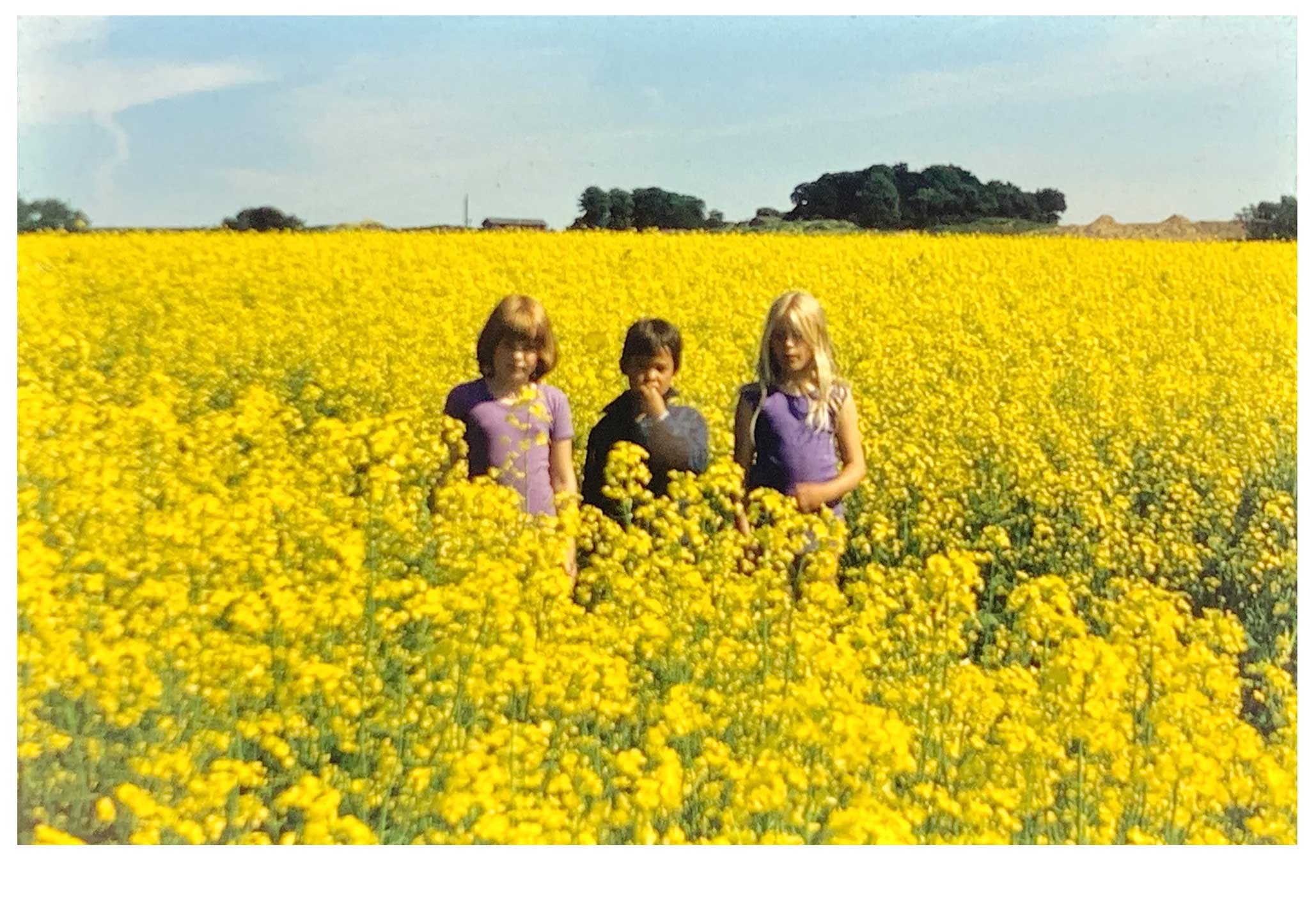
In his new series of copper prints, Michael Chang takes memory as his starting point. But whereas memories are fluid and often blurry at the edges, he has found an almost scientific method: isolating colours from old family photographs, removing them from their original context, and transferring these liberated colours into graphic works. Gone are the images themselves—a mother in the garden, a child in a cherry tree, or someone posing in a yellow rapeseed field. What remains is the feeling, the atmosphere, the essence of remembering itself.
But remembering is one thing. What we choose to carry with us is another.
Our memories are far more pliable and adaptable than we tend to believe. We constantly, and often unknowingly, reshape the past to better fit the present we want to inhabit. This becomes clear when we compare our memories of a given situation with those of others who were also present. Very often (and quite surprisingly), it turns out we remember the same situation completely differently.
Even photographs change over time—especially analog, physical ones that carry our past from before everything became digital. They deteriorate, their colours shift, and they become scratched from repeated handling. In Chang’s family, slides were used frequently—just like in many others. I can still recall the smell of the crackling canvas screen we viewed them on in my family. The sound of the slide projector clicking—ka-klonk!—as another image appeared, and we excitedly shared the experience with one another all over again, out loud.
This is how shared memories are created, how our recollections begin to align. And this is how we influence each other—just like colours do when they come close together. Artists have long explored this, but in the 19th century, colour also became the subject of more scientific analysis. These theories inspired the Impressionists and especially the Pointillists later in the century. The interest carried into the 20th century, where movements like Orphism developed them further in a more abstract direction.
As early as the 1910s, Kazimir Malevich created what is likely the first fully monochrome painting, Black Square. And in the more than 100 years since, contemporary art has returned to this theme again and again. But these works are rarely purely single-coloured surfaces. Barnett Newman, for example, added narrow stripes of contrasting primary colours to his vibrating reds in the four versions of Who’s Afraid of Red, Yellow and Blue from the late 1960s. Still, it is likely Newman’s friend and colleague, Mark Rothko—with his horizontal bands of pulsating colour—who stands as the most obvious artistic ancestor or inspiration for Chang’s latest series. But those are only superficial connections. Chang’s works have their own distinct purpose—positioned somewhere between American Abstract Expressionism, Minimalism, and Eastern philosophy. Nothing less.
To support this, Chang has developed his own “art of limitations,” a set of rules or dogmas within which his works are created. All dimensions are based on his own body measurements, and another guiding principle is that he must only use colours already available to him. This is practical, pragmatic, cost-efficient, and ecologically responsible. But more than that, the rules eliminate a whole range of unnecessary choices and free Chang to focus on other aspects of making art.
A central focus is colour—because when a work consists solely of colour, colour becomes crucial. Chang mixes his own hues from pigments, and over the years has built a library with records of mixing ratios and colour samples. Yet, even though it may look like he has put everything into formulas, he constantly challenges himself as an artist. In this case, by choosing copperplate printing as a method—one that required him to collaborate with professional printmakers, rather than working alone as he usually does, and to translate his colour library into graphic prints.
Both aspects turned out to be more successful than expected. But even if the tangible results—the prints— had failed, Chang would not have seen it as a failure. For him, it’s the process, and in this case also the conversations along the way, that matter most. And this "most important thing" is what the artworks, in a sense, stand as evidence of. A bit like memories—imprinted on our minds by events, but shaped like stones at the water’s edge by our ongoing imagination and interpretations: unique, interconnected, fragile like ourselves, and essential for our future.
Record Summary
- Type
- Catalogue Text
- Published
- Author
- Trine Ross
Archive Context
Colours Collected From A Childhood was written by Trine Ross in 2020 in connection with Michael Baastrup Chang’s project of the same title.
The project uses colours isolated from childhood photographs and transferred into copperplate prints, transforming personal photographic memories into abstract compositions.
The accompanying photograph preserved with this record depicts Michael Baastrup Chang at the age of five with two friends in a yellow rapeseed field in the summer of 1979. The slide photograph became part of the source material for Colours Collected From A Childhood.
The text is preserved here as an individual archival record within the catalogue texts section of the Michael Baastrup Chang Archive.