Appropriations
Project, 2011
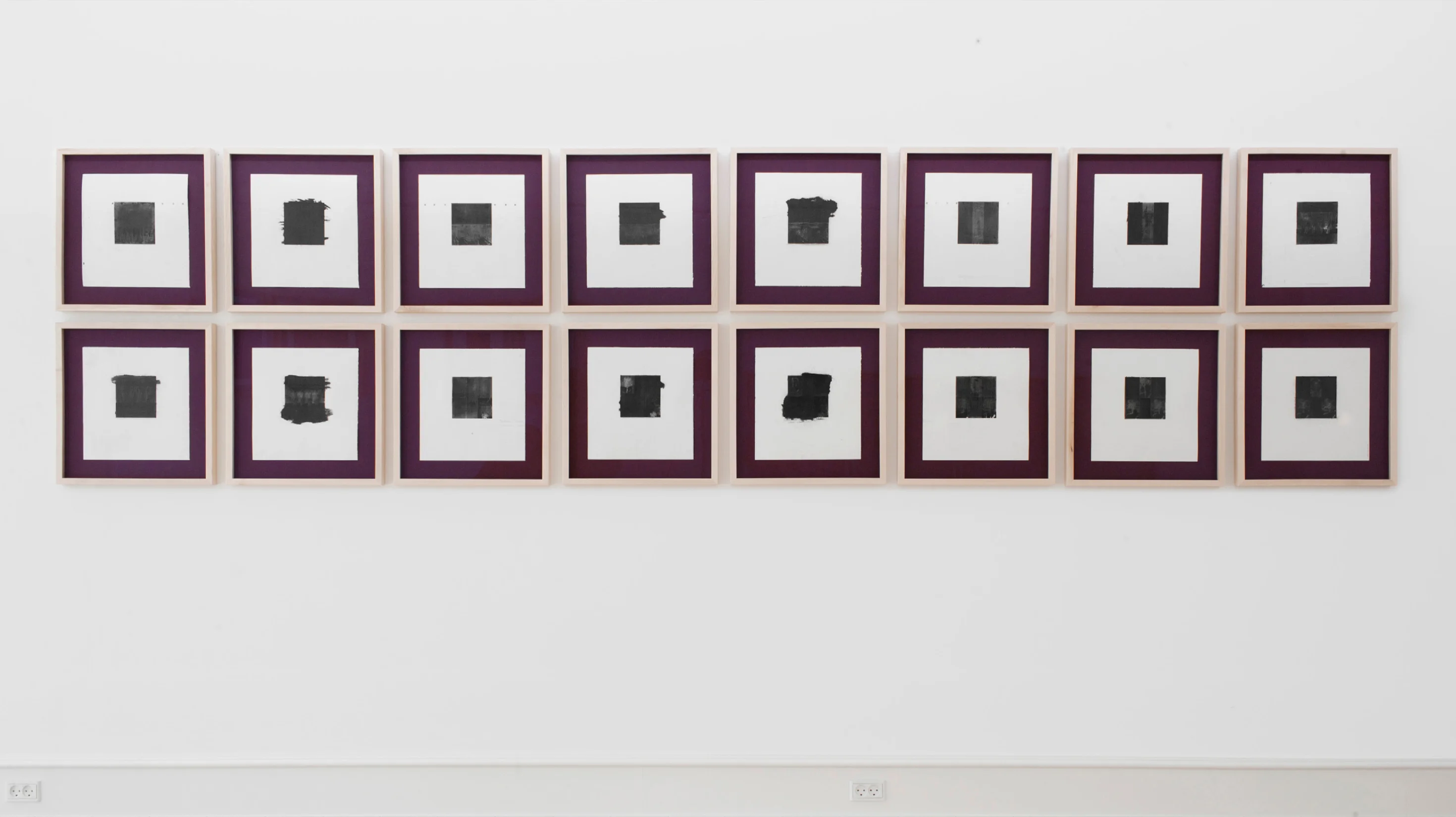
Fifty/fifty
In the film Painters Painting by Emile de Antonio and Mary Lampson, Robert Rauschenberg talks about his erased drawings. He explains how he made drawings himself and erased them. But to him, erasing his own drawings “seemed like fifty/fifty.”
In order for the erased drawing to be meaningful to him, the drawing he was going to erase had to “be art” to begin with. So he went to “Bill’s place” (Willem de Kooning) and knocked on the door.
ERASED de KOONING DRAWING by ROBERT RAUSCHENBERG, 1953
After going through portfolios of drawings looking for a potential candidate for erasing, Willem de Kooning said to Robert Rauschenberg, “These are drawings that I would miss.” He pulled out another drawing, put it back, and then said, “I will give you one, really hard to erase.”
“[…] he picked out another [drawing] and he was right. I spent, I think, nearly three weeks with no fewer than fifteen different kinds of erasers. And that made it real. I mean, I wasn’t just making a few marks and rubbing them out myself.”
Appropriation
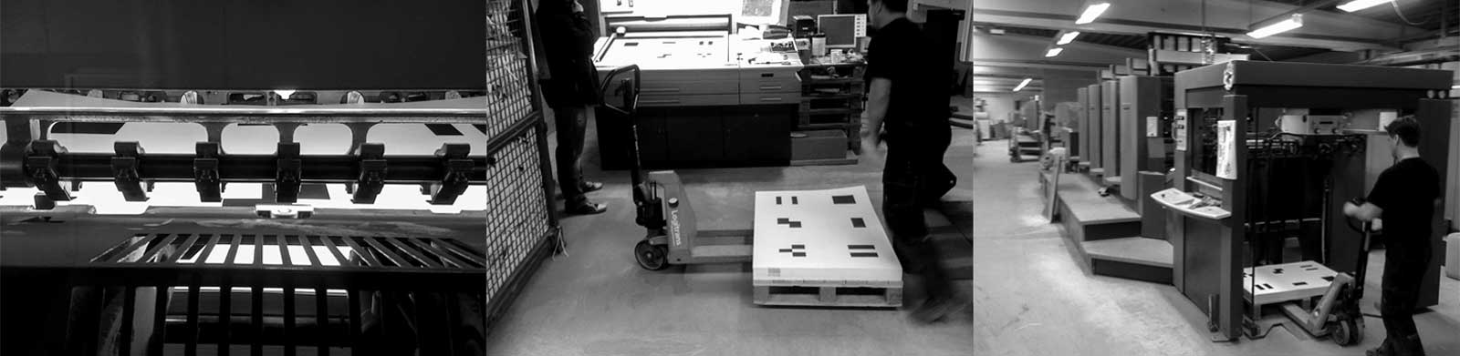
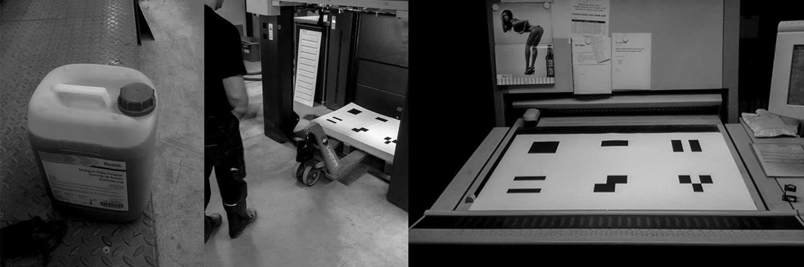
In 2011, Stig Bargsten, the owner of a printing company, let me use a commercial printing press to conduct an experiment of my own. I was curious to find out if it was possible to produce unique prints on a machine for offset printing.
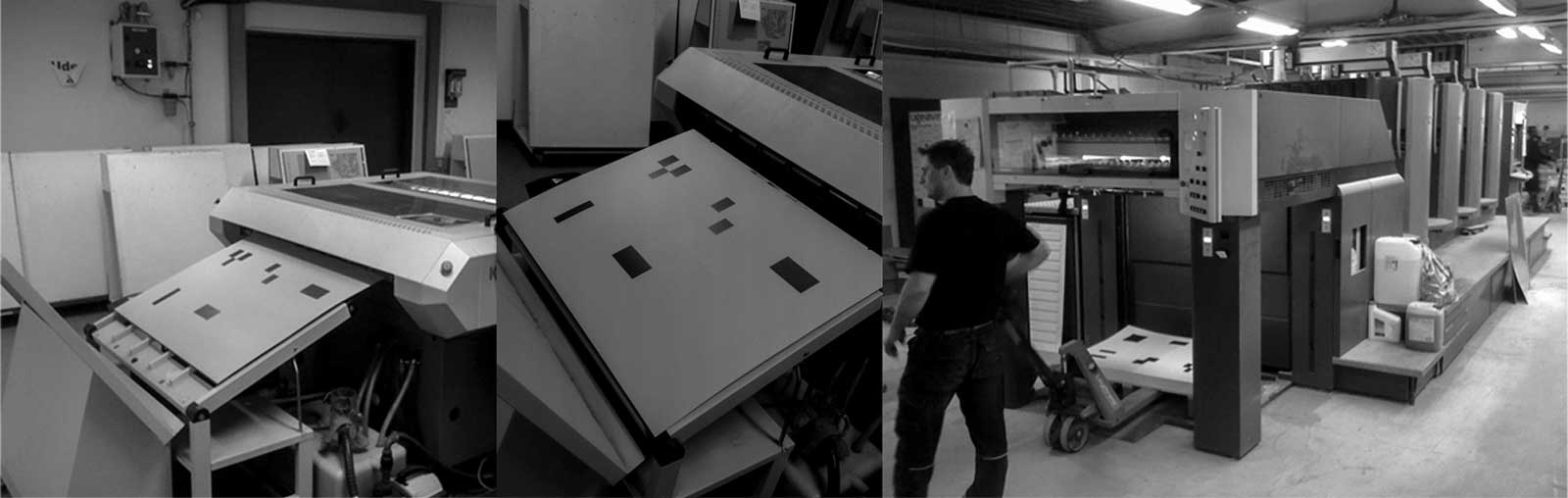
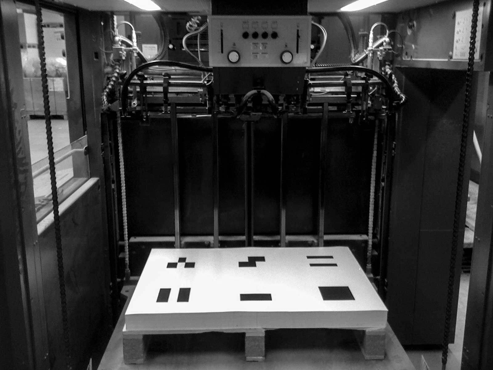
For the project, I wanted to emulate Robert Rauschenberg’s now famous Erased de Kooning Drawing by selecting a handful of my own predecessors and running their images through a machine while adding solvent to the plates, dissolving the rubber and slowly corrupting the printed images.
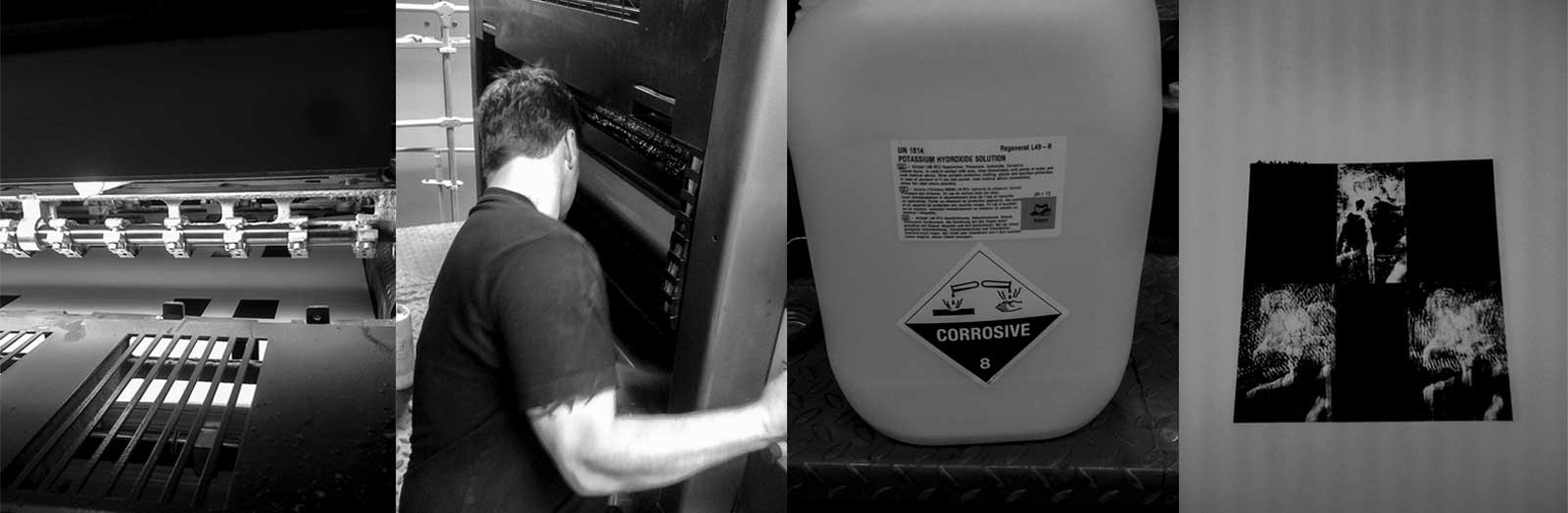
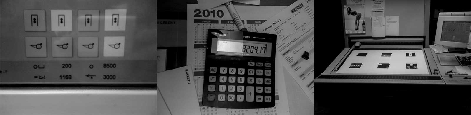
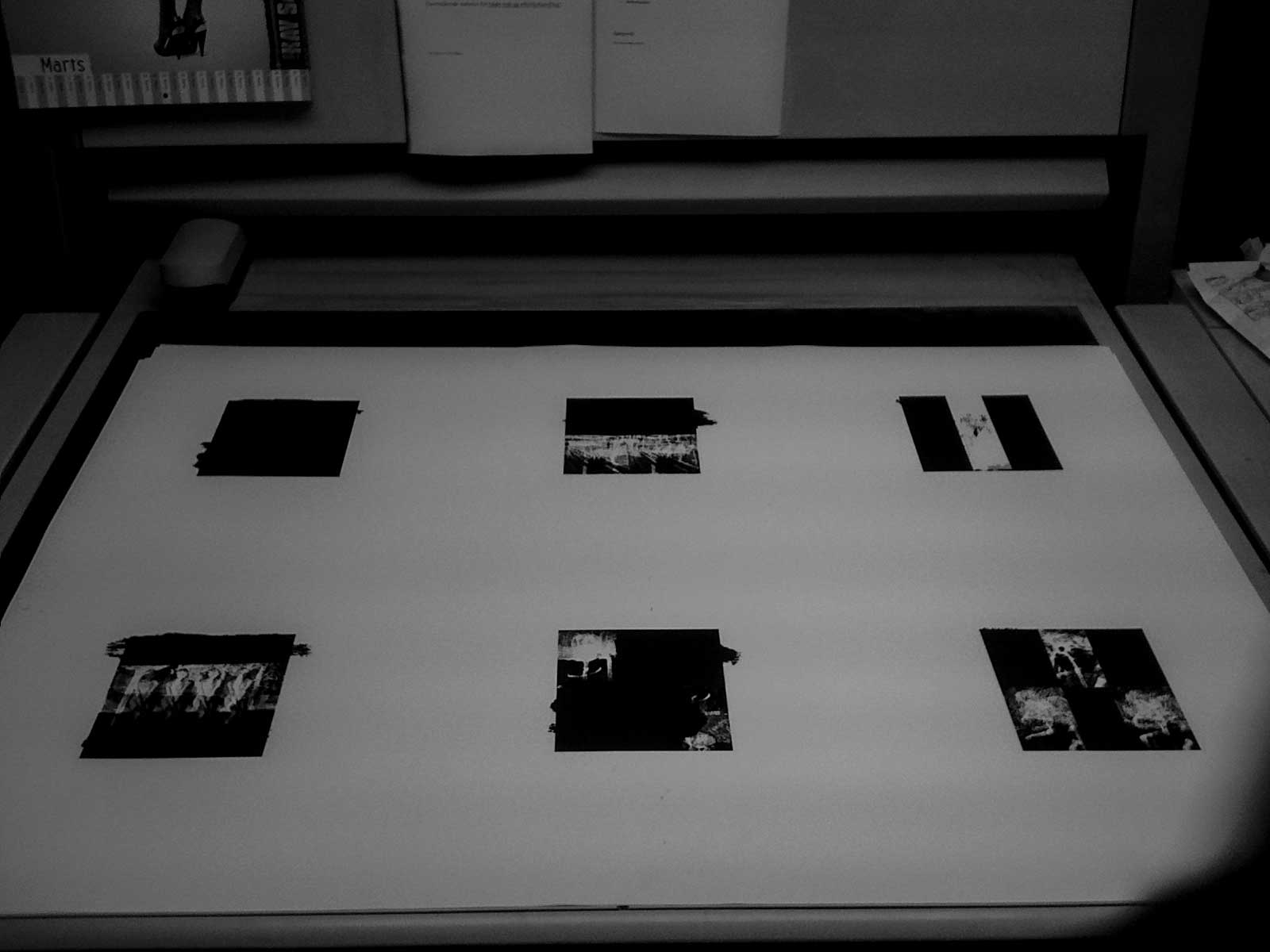
I added my newly found interest in numbers and used my own proportions as a kind of ruler. The idea was to make six works, simply because six would fit nicely on a sheet going through the printing press. The first work would be undivided. The second would be divided in two. The third into three sections. The fourth into four sections, the fifth into five, and the sixth into six sections.
In textual studies, a palimpsest is a manuscript page from which the text has been scraped or washed off in preparation for reuse. The word came to mind while doing this project and led me to use graphite and beeswax, applying force by hand to obscure the images further, to make it real, as Bob did in 1953.
Les Grandes Baigneuses by Paul Cézanne
I chose Paul Cézanne’s Les Grandes Baigneuses as the first, undivided work. The painting had made an impression on Pablo Picasso, and in a book I own, he is seen standing in front of a painting of his own version of the Baigneuses. It felt right to choose Cézanne’s work as the origin for the series.
- Les Grandes Baigneuses After Cezanne, 2011 (Variation 1)
- Les Grandes Baigneuses After Cezanne, 2011 (Variation 2)
Skrik by Edvard Munch
I chose Skrik after Edvard Munch as the second work. The original work is a print. It made an impression on me during my London years, where I was introduced to the work by a girl I met while living there. Her interest in the work made me look at Skrik a second time and through a different lens.
I had initially seen the work as something of a cliché. But after being told to look again and look closer, I found the work genuinely moving. Edvard Munch is rooted in Scandinavia, and his work continues to have a profound effect on me through his colours, figures and emotionally charged subject matter, particularly the dualism of life and death.
- Skrik After Munch, 2011 (Variation 1)
- Skrik After Munch, 2011 (Variation 2)
- Skrik After Munch, 2011 (Variation 3)
Triple Elvis by Andy Warhol
Triple Elvis by Andy Warhol felt like a natural choice for a field divided by three. There is a resonance between this work and the idea of printing something over and over again. Warhol instilled in me a genuine interest in collaborating with other artists, while at the same time almost making a caricature of the myth of artistic genius.
The collaborative dimension of Warhol’s practice also resonated with me. Working alongside other craftsmen, I was inviting the operator of a Heidelberg printing press into the work as a collaborator. In that sense, the making of the prints was not simply a process I controlled myself, but something that emerged through a relationship with the person operating the machine.
And just like Andy, I found myself interested in what could happen when the traditional idea of the individual artist making the work alone was opened up to others.
Puberty by Edvard Munch (Again)
I returned to Edvard Munch for the fourth work. I found his painting Puberty, and taking the figure sitting on the bed and replicating her four times pointed back to my debut exhibition, 4 Grades of Reality.
The word puberty also really resonated with this project. Choosing these art-world stars and overwriting their works in order both to pay homage and to pave the way for oneself is, in a sense, related to coming of age as an adolescent in the world of art.
- Pubertet After Munch, 2011 (Variation 1)
- Pubertet After Munch, 2011 (Variation 2)
- Pubertet After Munch, 2011 (Variation 3)
Study for a Portrait (After the Life Mask of William Blake) by Francis Bacon
The fifth work is Francis Bacon’s Study for a Portrait (After the Life Mask of William Blake). William Blake was a poet, painter and printmaker. Printmaking enters the conversation again here, tying the work to both painting and writing—all of which I am attracted to and use in my own art practice.
Francis Bacon made an impression on me early on. He has inspired other Danish artists tremendously, and his often bleak universe also appealed to me when I was beginning to paint. His work can be almost violent on the senses, and when you are young and want to make your mark, the work of Francis Bacon doesn’t disappoint.
There is another curious reason for my interest in Francis Bacon: he shares his name with another famous Francis Bacon, the philosopher. So the theme of the palimpsest becomes relevant again here, raising the question of making space for who you are through what you do.
- Study for a Portrait after Bacon, 2011 (Variation 1)
- Study for a Portrait after Bacon, 2011 (Variation 2)
- Study for a Portrait after Bacon, 2011 (Variation 3)
Saturn Devouring One of His Sons by Francisco Goya
The last work is about war, death and violence. And about parenthood—or, if you will, lineage. Perhaps not the best version of parenthood, but that is the point too.
Choosing Francisco José de Goya y Lucientes’ Saturn Devouring One of His Sons is a statement about looking at reality without romanticising it. Perhaps the choice is also about a young man’s hopes for the future, and about examining the struggle one has to be prepared to undertake to get there.
- Saturn Devouring One of His Sons after Goya, 2011 (Variation 1)
- Saturn Devouring One of His Sons after Goya, 2011 (Variation 2)
- Saturn Devouring One of His Sons after Goya, 2011 (Variation 3)
“Each age, it is found, must write its own books; or rather, each generation for the next succeeding.”
Beginning at the helm of a huge commercial printing press seems like a fine place to start an artistic journey.
Source Record
Painters Painting, directed by Emile de Antonio and Mary Lampson, A Mystic Fire Video, © Turin Film Corp., 1972.
Record Summary
- Type
- Project
- Title
- Appropriations
- Year
- 2011
- Artist
- Michael Baastrup Chang
- Medium
- Commercial printing, solvent, graphite and beeswax on paper
- Works
- Six groups of appropriated works comprising sixteen variations
- Record Status
- Published project record
Archive Context
Appropriations is preserved as a project record within the archive. The record documents the development of the project and the individual works produced through the experimental printing process in 2011. The sixteen variations are preserved as individual artwork records in the archive.