If you’re interested in contemporary abstract paintings, these essays explore the creative process, techniques, and inspirations behind Michael Baastrup Chang’s work as an abstract painter.

A Collection of Catalog Texts

Words on the works of Michael Baastrup Chang

by Trine Ross and Melissa E. Feldman

TABLE OF CONTENTS

FOREWORD

I first met Trine in my Frederiksberg studio in autumn of 2008. I remember that it was raining. Trine drew inspiration for the text she later wrote about my monochromes from an oak tree in the courtyard outside my workshop, and the way the autumn rain outlined the tree’s contours on the quadrangle. It was then that I became aware of the secret sisterhood between the images we imagine and those we produce.

I met Melissa in the summer of 2009 at Crown Point Press in San Francisco, where I produced a series of aquatints. My experiences at Crown Point Press felt like an alignment with universal energies. Meeting Melissa was one of many déjà vus I had while in the USA that summer. I don’t remember the words we exchanged, but the memory remains as a mixture of blue, green, brown and purple hues.

Between my image plane and the texts of these two writers there is a concordance, a kind of resonance. It is a human transmission, and I feel privileged to be on its wavelength.

Michael Baastrup Chang
Copenhagen – Østerbro
October 2009

Everyman

Melissa E. Feldman. MA in Art History, Independent curator and writer. Published: 2009. Piedmont, California.

Michael Chang came into my life suddenly and vanished as quickly. We met last August (2009) when he was in San Francisco producing aquatints at Crown Point Press for this exhibition. His timing was perfect—I was in town briefly between summer trips and was able to meet him the next day. (It’s a good thing too, because the prints—and the artist—were shipping out in two days’ time to Copenhagen.)

Arriving at Crown Point, a tall, dark-haired youngish man greeted me with an accent and a face I couldn’t place. He spoke English with confidence and apart from his height, Chang didn’t look particularly Scandinavian. He struck me as being a kind of Everyman, someone who could fit in anywhere, be it Lhasa or Manhattan.

We chatted and I asked a lot of questions and studied the prints, all aquatints in a minimalist style. Two of the series were complete: a handsome group of aquatint and chine collé, 77 by 55 cm, that starts out all white and ends, seven prints later, with an all-violet impression, and a smaller oblong series of four whose main drama is a diminishing midline dividing its washes of gray-greens and bronze, some in a striped moiré pattern befitting a Renaissance waistcoat. There was also an unfinished set of gridded variations on a squarish, book-size paper. This set was to be editioned; all the others are unique.

Chang showed me a digital image of an ambitious, 15 by 6-foot multi-panel painting, The Man Without Qualities (2009), that would accompany the new aquatints. This imposing work, a tour de force from what I could tell, comprises eight vertical panels, all 54 by 185 cm except for the central bone-white one which is a bit wider, and each painted a different muted red, green, yellow, purple and black. It resembles the American artist Brice Marden’s classic minimalist works from the early 70s (also oil and wax), yet it is less formalist and studied. Chang’s shifts in color seem more naturally occurring, an unforced sequencing that seems to mirror the shifting color of water under an overcast sky, or the way one thought leads—or leaps—to another.

Chang explained the meticulous coding system involving the number of staples attaching the canvas to the stretcher and how he works on them flat and selects a different brush size and directional stroke for each one. Yet when asked why he named the work after the novel by Robert Musil[1] he said the title just seemed apropos though he had not read the book. By now I was beginning to grasp Michael Chang’s paradoxical approach: order colliding with chance and intuition.

It was completely by chance, for example, that he discovered the work of Brice Marden, one of the abstract American painters whose work was inspirational for him, and his first monochrome painting came about by accident. The monochrome stands as the ground zero of painting, a beginning and an end. That is how it went for Chang, when he made his first monochrome painting by inadvertently ruining his last—and he says best—figurative work.

In Chang’s native Scandinavia, figurative traditions prevail over abstraction, both contemporary and historical. Chang himself made figurative work until two years ago (2007). Vaguely surrealist, these earlier paintings feature an isolated figure or object, such as two fish trapped in a glass jar, set in a tonal background of uncertain depth.

Still, Chang’s abstract work bears a Nordic sensibility that can be traced back to the late 19th-century Scandinavian symbolists, whose most famous affiliate was Edvard Munch, in its reductive formal means and sense of interiority. Unlike the brilliant palette and empirical realism of their French counterparts, the moodier modernists in the North opted for Whistleresque tonal and monochromatic color, and flat, shadowless light.

As a cultural mistizo with a Danish mother, an Asian father, and a British education, his attraction to the monochrome begins to make even more sense. The idiom encompasses ancient archetypes and Eastern zen, modern architecture and Western doubt. This mutability, perhaps, accounts for its remarkable resilience.

Kazimir Malevich is responsible for its modern identity. Since then (1917) the monochrome has been adopted by artists working all over the world from the early Italian conceptualists Piero Manzoni and Lucio Fontana, to the heady meditations of Yves Klein, Yayoi Kusama, James Lee Byars, and Wolfgang Laib. It serves the deconstructivist investigations characteristic of Americans Robert Ryman and Ad Reinhardt. More recently, in the work of Glenn Ligon, Byron Kim and Alejandro Otero, the monochrome bears the inscription of identity politics. As a visual paradigm, it can be an image, a denial of imagery, a state of mind, an iconoclast.

“After more than 12 years of unsuccessful attempts at trying to find a connection to the art I felt that I was supposed to be making, I left Denmark and visited the USA for the first time.”[2] That was in 2007, before Chang’s interest in abstract painting took hold. Chang’s story recalls Agnes Martin’s rite of passage from abstract expressionism to her mature minimalist style: “I painted for 20 years without painting a painting that I liked.”[3] That is, until she got to New York and saw non-objective painting.

In the larger prints, Chang begins the series with lightness and darkness: a white image and a black one. The ones in between seem to build towards the symphonic finale, a bar code of irregular stripes comprising the colors—black, white, gray, and violet—isolated in the preceding prints. The white is actually an impression of the plate itself, including dirt and grease marks. The velvety bottomless black is the result of being “bitten” for two 50-minute sessions in an acid bath. The parameters of the printing process and visuality thus marked, the work moves into another basic measure of picture-making and seeing: dividing the plate equally between two blacks, whose difference is barely discernible, then two whites. Such subtle variations in tone are a specialty of aquatint. Then the violet makes its entrance in a cloudy monochrome.

The new works demonstrate the classic Minimalist penchant for subtle geometries that operate on a perceptual level, but Chang’s approach is more dramatic and free-associative. There is a baroque quality to the contrasting forms and divided surfaces, as well as in his use of scale and sequencing. There is a touch of romanticism in Chang’s color choice. (The artist likes to contemplate his work in different natural light, including moonlight.) For example, in the print with the two blacks and the print with smaller green/gold striped pieces in the oblong series, the tonal change comes across spatially, as if in bas relief, as well as pictorially in terms of color, hue, and pattern. One needs to shift position to determine whether external lighting accounts for the flashing stripes and shifting blacks or if these differentiations occur within the image itself. As always, the answer is yes—and no, in Michael Chang’s elusive, straightforward art.

[1] Robert Musil (1880–1942), Austrian author of the (unfinished) modernist novel Der Mann ohne Eigenschaften. [2] Quoted from e-mail exchange between the artist and curator, September 2009. [3] Interview with Irving Sandler in Germano Celant, Agnes Martin: Paintings and Drawings 1977–91 (London: Serpentine Gallery, 1993), 13.

Rejected

Trine Ross. MA in Art History, Art critic, writer and lecturer. Published: 2009

“Rejected” is a strange word.

An arrow can point a driver off the motorway and towards their destination — but rejection can also feel like a slap in the face. We’ve all experienced it: being pointed in the right direction, and being turned away. And we’ve all rejected someone or something ourselves. Most of the time we think of rejection as negative, even shameful. We’ve been weighed and found wanting. We weren’t good enough. We didn’t measure up.

But rejection isn’t always a bad thing.

Certain materials repel each other — with intriguing results. And often, with the sharp hindsight of experience, we realise that a rejection was actually a stroke of luck. You bump into an old flame and suddenly see why that relationship could never have ended well — if it had ever got off the ground. Or, as the English saying goes: when one door closes, another opens. And perhaps that was the door we were meant to take all along.

We’re all constantly making choices, and every choice has consequences. In daily life we may not think much about that, but for an artist it’s different. Artistic choices shape the direction of the entire practice. Michael Chang speaks of a long process of elimination — a series of choices and refusals that have brought him to this point, to where he and his work now stand.

This place was never marked on a map. In fact, he never imagined that this would be how he’d end up working, or that this was what he would want to do. But because he has kept choosing, accepting and rejecting, thinking and sensing his way forward, the artistic place he now occupies feels exactly right. For him. For now. Along the way, Chang has studied art and philosophy from earlier times — from the Byzantine Empire and the Romans to modern art in New York, from Plato and Freud to Heidegger.

But he doesn’t study for study’s sake — the focus is always on the images he’s going to make. Even if he doesn’t consciously think about everything he’s read once he starts working, those ideas form a kind of foundation, a humanist bedrock that gives his work a sense of grounding. So it’s not entirely surprising that one of the pieces rejected by the Spring Exhibition at Charlottenborg can make you think of literal building blocks — though that’s perhaps just coincidence.

In one of Chang’s many notebooks there’s a diagram showing how art moves from the known to the new. He’s drawn two possible routes: one passes through tradition and renews it; the other chases sensation — the completely new, the never-before-seen. But, as Chang rightly points out, just because something is new doesn’t mean it’s relevant. He chooses to build on tradition, and in doing so avoids several of the traps that await those who go down the path of pure novelty.

Focus too much on the new, and you face the constant fear of being overtaken — of not being original or fresh enough. That pressure to keep ahead inevitably comes at the expense of quality. And other artists become competitors rather than colleagues to learn from — something Chang values deeply. His sources of inspiration are as likely to be old masters as young artists working right now at the frontier of experimentation.

The result is a body of work that both looks back to art history and defines itself as a set of open questions. Among the “rejected works” are the four large pieces that didn’t make it through the eye of the needle at the Spring Exhibition, alongside a series of smaller works drawn directly from Chang’s sketchbooks. Here he has acted as his own jury, leafing through the pages in search of those sketches that, as he says, “glimmer”.

Most people could follow him that far. But Chang adds an extra twist to his selection: he has deliberately chosen several sketches he doesn’t actually like. They’re too pretty, too decorative — too superficially entertaining. “They expose me,” he says. Yet he has decided to work with them precisely because he senses they might open a path towards something he’s searching for. In dialogue with the rejected works, these pieces invite viewers to ask the same questions that he asked himself during the selection process: What do I like? What don’t I like? And why?

All the works are made with graphite on paper — an exploration of material as much as of image. The meeting of graphite, linseed oil, beeswax and paper produces a wealth of subtle tones. And nuance is everything, especially when working in a non-figurative mode. Each drawing is done freehand, by eye, using the artist’s own body as a measure — a repeated field might be two fingers wide and one finger long.

In striking contrast to the calm of the finished works is the physical process of making them, which demands energy and strength to press the graphite deep into the paper. On one hand there’s order and carefully defined fields; on the other, the paper lives its own life, adding its own accidents. In some places tiny white specks still show through the graphite; in others the raised fibres of the raw paper have been so compressed that they twist and buckle. Seen up close, Chang’s works contradict the sense of serenity they project from a distance — within the details, small dramas unfold.

And because graphite constantly changes character with the light that hits it, these works are at once precise and in perpetual motion. They catch the light and throw it back. Planes shape themselves in relation to each other, yet remain forever apart. Rejection takes on a new meaning here: to reject becomes an act of reflection — of defining oneself as form against the white of the paper.

Regarding The Journeyman

Melissa E. Feldman. MA in Art History, Independent curator and writer. Published: 2011. Piedmont, California.

Recently Michael Chang wrote about affinities in the work of an unlikely triad of artists—Damien Hirst, Bob Dylan, and Her Majesty Queen Margrethe II—proposing artmaking as a great equalizer between people, be they rich, poor, famous or obscure. He notes that “the chances of us becoming colleagues outside the realm of painting are slim.” Last year Dylan, who explains that “If I could have expressed the same in a song, I would have written a song instead”, “came out” as a painter with a show at the National Gallery of Denmark. While Hirst’s blockbuster art epitomizes the late twentieth-century artist, Her Majesty Queen Margrethe II exercises her passion for and considerable gifts in both ecclesiastical embroidery and landscape painting, her royal position notwithstanding. In the case of Dylan and Her Majesty, artistic identity does not function in its usual elitist manner; on the contrary, it has a normalizing, even humanizing, effect on how we view these untouchables.

The works comprising The Journeyman might be understood as extending the purview of Chang’s dialogue with artistic “colleagues” to include Francis Bacon, Paul Cezanne, Francisco Goya, Edvard Munch, Andy Warhol, as well as a few American minimalist painters encountered through the artist’s armchair and airplane travels. But before we get to them, let’s talk about his other colleagues: all of you.

You can qualify by adding your marks or words to Y (2010), a monumental, multi-panel blackboard. Mine would say, “why not?” Using a blackboard as surface and support creates a role reversal in which the visitor/student becomes the artist/teacher, where touching and graffiti are allowed, confessions become public information, and the picture is always impermanent. Words and images are interchangeable, and the work is always both finished and unfinished. Accordingly, the scale and narrow proportions of the panels underscore the physical (as opposed to cognitive) action of markmaking. The height corresponds to the artist’s height and the width of each panel equals that of his extended arm from shoulder to fingertips. For Chang the piece represents “a catharsis, a getting rid of words and thoughts, emptying myself and stop verbalizing everything.”

The same can be said of Chang’s new monochrome paintings in homemade egg tempera whose satin surfaces show nary a brush mark. The surface quality is the result of a labor-intensive process of sanding successive applications (at least three) of chalk and then egg white. If it weren’t for the ragged bottom edge revealing its layered history, the works would not appear to have been painted at all. Despite the medium’s medieval origins, the egg temperas remind me of the perfect monochromatic fields that California Light and Space artists of the late sixties such as John McCracken and Robert Irwin produced—fields that reflected Los Angeles’s clear skies as well as the flawless surfaces of their automobiles and surfboards.

In the works that comprise The Journeyman Chang opens up his practice to different kinds of processes and materials, both traditional—the egg temperas for example—and newfangled. As in postminimalism, or so-called process art of the early 1970s exemplified by the work of such artists as Barry Le Va and Bruce Nauman, Chang’s new work walks a fine line between the intentionality of a set procedure and the physical limits of the operator (artist) and his materials.

In the Appropriations (2011), Chang wrangled a large commercial printing press—for what could be more intentional than a machine? Seeking to undermine the reproduction quality of images of works by Warhol, Munch, and Cezanne among a few others, he reprinted the same sheets (all 1,168 of them) four times using corrosive liquid to corrupt the image. Paradoxically, the resulting splashing and dripping offset ink resembles running paint. Next Chang covered the image with hand-applied graphite and beeswax, further obscuring the image while at the same time physically and symbolically embedding an artistic ancestry in the signature geometry of his work.

Printmaking is one of the principal ways Chang expresses his interest in elaborate technique and layered mediums and the ultimate mystery of their interaction. He embraces the vagaries of chance operations both in the studio and in life, where he assimilates people and opportunities that come his way.

In the series entitled Folds, for example, Chang recuperates scraps of lovely Somerset paper left over from the prints he made at San Francisco’s renowned Crown Point Press into a series of bas-reliefs made by folding the paper, from six down to one time, and displaying them unfolded. Irregularly shaped with deckled or torn edges, some are just a sliver at 1/2" by 12", reminiscent of an archaeological fragment.

The last reproduction in the catalogue is the single fold, Irregular Shape Folded Once, and as Chang pointed out, then you close the catalogue “which is a little folding as well.”

Melissa E. Feldman is an independent curator and writer currently based in the Bay Area, California. A contributor to Art in America, Frieze, and Third Text, among other publications.

The Artist as Gardener

By Trine Ross. MA in Art History, Art critic, writer and lecturer. Published: 2012

There is an old Chinese proverb that says: He who wants to be happy for a day, gets drunk. He who wants to be happy for a week, slaughters a pig. He who wants to be happy for a year, gets married. But he who wants to be happy for life, becomes a gardener.

And it is precisely the act of gardening that forms the core of Michael Chang’s practice. Though he is an artist, he nevertheless sees himself as a caring gardener, one who helps his growths along their way. Everything they need, and everything they will become, already lies latent in the seed. Thus, it is solely his task to give these seeds the best possible conditions for growth.

However, Chang's seeds are not planted in soil. Instead, they are hidden within the materials and the thought processes he uses to work on his pieces—both physically and mentally.

But it hasn’t always been this way: until 2007, Chang worked in a very different style, with different expressions and aims. Back then, it was about figuration, technical skill, and what is traditionally called talent. You could also call it mastery—and while an artist must know their materials, overt skill isn't always an advantage.

This led Chang’s artistic practice to take a significant turn—away from recognizable figures and, more importantly, toward an artistic approach centered on exploring painting, materials, and what they do to him and to us. Gone, too, is the hectic and contemporary demand for constant innovation, which has allowed him the peace to rediscover old techniques such as tempera. In doing so, something quite wondrous happens: a completely unforced renewal of visual language emerges. Because even though the technique is thousands of years old, we have never seen it used in the way Chang does.

On a technical level, Chang has also found his own paths, beginning with priming the raw canvas. For this, he uses slaked lime—that is, crushed bones from various animals that lived around Stevns Klint several million years ago. This, to put it mildly, historical foundation is built upon using eggs, which carry equally far-reaching philosophical, symbolic, and very practical meanings. For the egg, like the seed, is the beginning—carrying all of the future in a complete whole—while the whites bind and stick together, and the yolk's lecithin content makes oil and water blend harmoniously.

The technique requires patience. Though the first four layers of alternating lime and egg whites dry in a couple of days each, the tempera takes much longer to oxidize and bond with the surface. Tempera is a mixture of water, linseed oil, and egg yolks, with added selected pigments. To avoid cracking, the canvas must rest untouched for about seven weeks before a new layer of pigmented tempera can be applied.

The many layers that make up each work not only take time—they also yield a wealth of experience. Chang experiments with his brushstrokes, which, in his hands, become a material in themselves. Likewise, he explores his colors, often achieved by combining complementary colors that normally lie at opposite ends of the spectrum. Yet (or perhaps because of this), the result is harmonious, with great depth and subdued intensity in the colors. What emerges is a method that is investigative and almost intuitively scientific, where the artist's ego is no longer central. Instead, Chang makes room for the process, where the work functions on its own—and as a document of its own creation.

Naturally, things sometimes grow the wrong way. There were supposed to be fruits on the plant, but there aren’t, and so the gardener must intervene—must do something different than before, since what he has done so far clearly hasn’t worked. And in that, something new is learned. Other times, things succeed a little more easily—but even then, a work is not guaranteed survival. Occasionally, even well-functioning works must be sacrificed so that something new may sprout in their place. What that may be, and what it might become, Chang does not know—but he ensures clean water and good lighting.

This may lead to large tempera paintings that alternate between manifesting themselves in space and disappearing before your eyes. Or it may result in a series of copper prints that combine multi-generational recipes with eggs and accompanying children’s drawings. In truly exceptionally happy circumstances, Chang may even recognize his own growths in the works of other artists—as is the case with Mette Ussing. Here, a communication has arisen—not just between two artists from different generations and starting points, but also between their works, which seem to have grown in greenhouses that resemble one another.

Together, these growth-works create a new hybrid—whose cuttings one can only look forward to following in the future.

Table of Contents

Colors Collected from a Childhood

Trine Ross. Master of Art History, art critic and writer at Politiken, lecturer, author, and (art) debater. Published: 2020

Even though few have read In Search of Lost Time, most people know that it is a madeleine cake that sends Proust on a journey through memory. And we all know the sensation: how a scent, a shaft of light, or a particular color can suddenly unfold memories we barely remembered having.

In his new series of copper prints, Michael Chang takes memory as his starting point. But whereas memories are fluid and often blurry at the edges, he has found an almost scientific method: isolating colors from old family photographs, removing them from their original context, and transferring these liberated colors into graphic works. Gone are the images themselves—a mother in the garden, a child in a cherry tree, or someone posing in a yellow rapeseed field. What remains is the feeling, the atmosphere, the essence of remembering itself.

But remembering is one thing. What we choose to carry with us is another.

Our memories are far more pliable and adaptable than we tend to believe. We constantly, and often unknowingly, reshape the past to better fit the present we want to inhabit. This becomes clear when we compare our memories of a given situation with those of others who were also present. Very often (and quite surprisingly), it turns out we remember the same situation completely differently.

Even photographs change over time—especially analog, physical ones that carry our past from before everything became digital. They deteriorate, their colors shift, and they become scratched from repeated handling. In Chang’s family, slides were used frequently—just like in many others. I can still recall the smell of the crackling canvas screen we viewed them on in my family. The sound of the slide projector clicking—ka-klonk!—as another image appeared, and we excitedly shared the experience with one another all over again, out loud.

This is how shared memories are created, how our recollections begin to align. And this is how we influence each other—just like colors do when they come close together. Artists have long explored this, but in the 19th century, color also became the subject of more scientific analysis. These theories inspired the Impressionists and especially the Pointillists later in the century. The interest carried into the 20th century, where movements like Orphism developed them further in a more abstract direction.

As early as the 1910s, Kazimir Malevich created what is likely the first fully monochrome painting, Black Square. And in the more than 100 years since, contemporary art has returned to this theme again and again. But these works are rarely purely single-colored surfaces. Barnett Newman, for example, added narrow stripes of contrasting primary colors to his vibrating reds in the four versions of Who’s Afraid of Red, Yellow and Blue from the late 1960s. Still, it is likely Newman’s friend and colleague, Mark Rothko—with his horizontal bands of pulsating color—who stands as the most obvious artistic ancestor or inspiration for Chang’s latest series. But those are only superficial connections. Chang’s works have their own distinct purpose—positioned somewhere between American Abstract Expressionism, Minimalism, and Eastern philosophy. Nothing less.

To support this, Chang has developed his own “art of limitations,” a set of rules or dogmas within which his works are created. All dimensions are based on his own body measurements, and another guiding principle is that he must only use colors already available to him. This is practical, pragmatic, cost-efficient, and ecologically responsible. But more than that, the rules eliminate a whole range of unnecessary choices and free Chang to focus on other aspects of making art.

A central focus is color—because when a work consists solely of color, color becomes crucial. Chang mixes his own hues from pigments, and over the years has built a library with records of mixing ratios and color samples. Yet, even though it may look like he has put everything into formulas, he constantly challenges himself as an artist. In this case, by choosing copperplate printing as a method—one that required him to collaborate with professional printmakers, rather than working alone as he usually does, and to translate his color library into graphic prints.

Both aspects turned out to be more successful than expected. But even if the tangible results—the prints—had failed, Chang would not have seen it as a failure. For him, it’s the process, and in this case also the conversations along the way, that matter most. And this "most important thing" is what the artworks, in a sense, stand as evidence of. A bit like memories—imprinted on our minds by events, but shaped like stones at the water’s edge by our ongoing imagination and interpretations: unique, interconnected, fragile like ourselves, and essential for our future.


REFERENCES

Afvist
4 Grades of Reality
Interferens
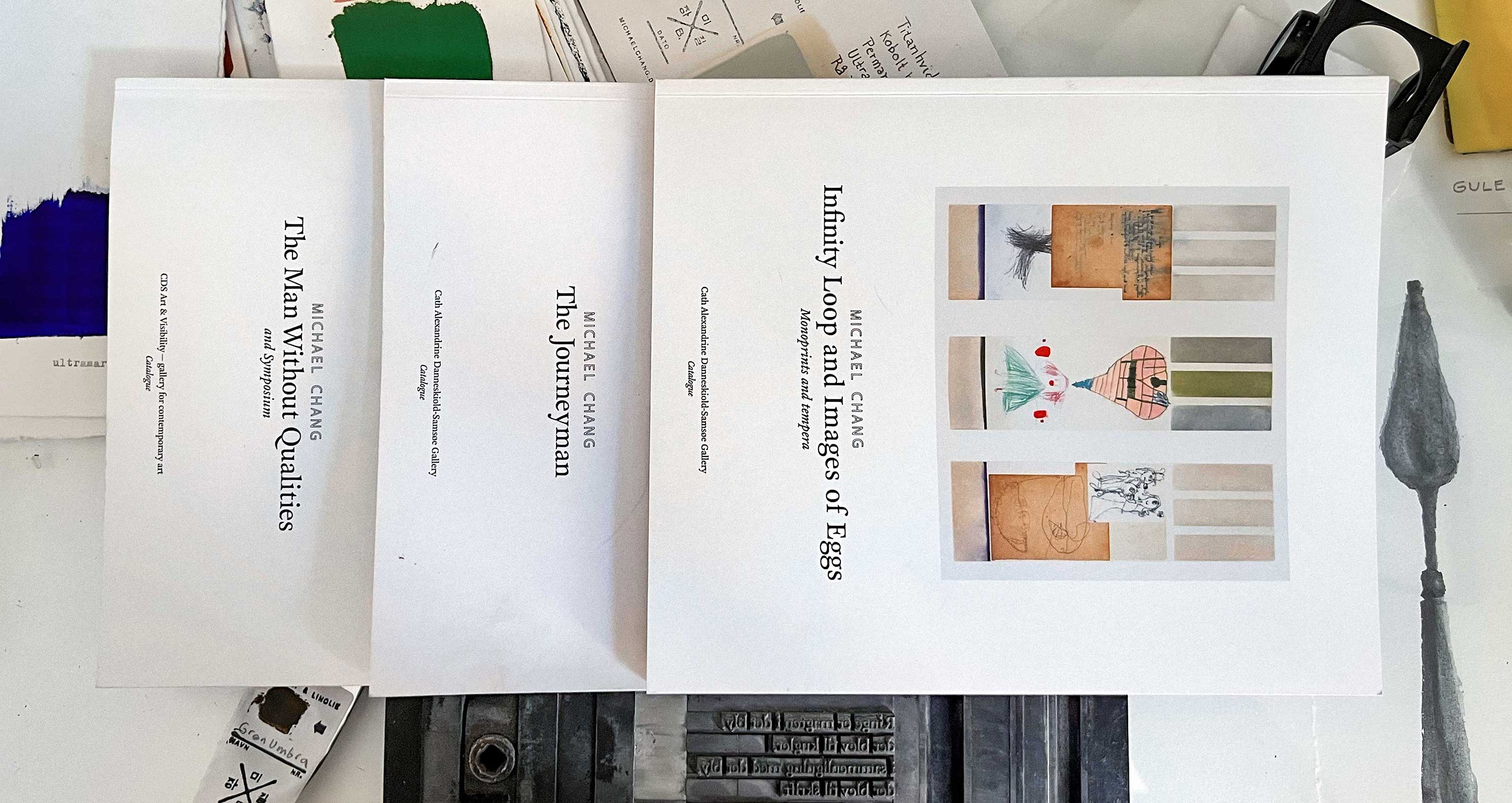
The Man Without Qualities
The Journeyman
Infinity Loop and Images of Eggs
Dansk krop overmaler Munch, Warhol og Bacon med sort
Naughty Visual Artist

Michael Baastrup Chang - CV